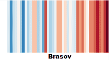
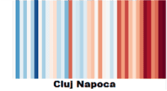
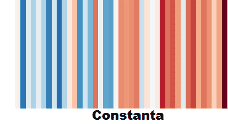
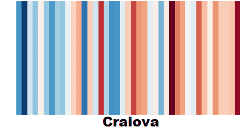
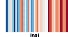
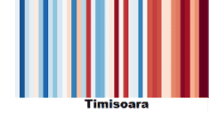
The #showyourstripes campaign takes place every year on June 21st and is inspired by data visualisations created by Ed Hawkins, a climate researcher at the University of Reading in the United Kingdom and lead author of the Intergovernmental Panel on Climate Change’s (IPCC) Sixth Assessment Report. He developed the “warming stripes” graphic, a collection of visual representations of temperature changes measured in each country over the past 100 years or more. Each stripe represents the temperature of that respective country, calculated as an annual average. For most countries, the stripes start in the year 1901 and end in 2018. For the United Kingdom, the United States of America, Switzerland, and Germany, the data begins in the late 19th century.
Climate changes and global temperature warming are not just future issues but also present concerns. And our recent as well as distant past can provide us with clues for addressing them.
A Race Against Time and a Final Call to Respect the 1.5°C Threshold
The choices we make and the actions we implement in this decade will have an impact in the near future and even for the next millennium. This synthesis indicates that we are approaching “irreversible” levels of global warming with catastrophic consequences, and that “now or never” is the moment to take drastic measures to reduce greenhouse gas emissions in order to avoid potential disaster.
The next IPCC report is expected in 2030, which means that with the publication of the IPCC AR6 report, there’s still a chance to keep the global average temperature increase under 1.5°C compared to the pre-industrial period. The fundamental physics of climate change are well understood, and the effects of climate change are highly visible, suggesting that we might have IPCC reports appearing even earlier than 2030, serving as a scientific basis for decision-makers in the upcoming critical period.
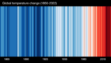
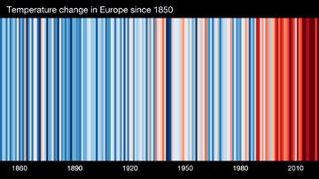
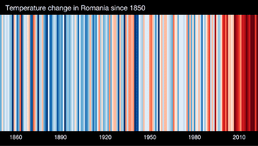
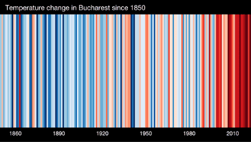
Climate stripes of the planet, of Europe, Romania and Bucharest
Additionally, with the Climate Data Store – ERA5 Explorer service provided by Copernicus, we can experiment and observe the warming stripes that offer an overview of the annual temperature trends in cities across Romania for the period 1979-2020.
The colour of each stripe represents the temperature anomaly for a specific year, indicating how much warmer (red) or cooler (blue) that year was compared to the long-term reference period of 1981-2010.
